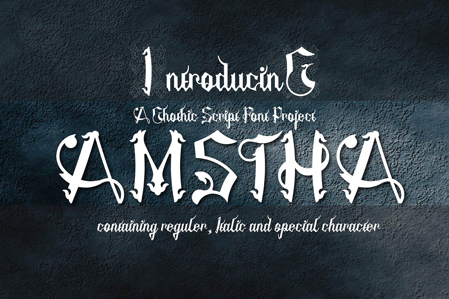
Amstha Typeface: A Gothic Blackletter Font for Dark, Moody Digital Brands
I was staring at a blank Figma canvas at 2 AM, trying to decide if the hero section of this new boutique fashion site should feel minimalist or dramatic. The brand identity was rooted in alternative culture—think vintage leather, dark aesthetics, and a touch of rebellion. Standard sans-serif fonts felt too corporate, and standard serif fonts felt too traditional. I needed something with grit. Something that screamed edgy but still functioned on the web.
That’s when I pulled up Amstha. It’s a gothic blackletter font with a torn, ripped style that immediately caught my eye. As a UI designer, I’m always skeptical about decorative typefaces because they often break readability or load slowly. But Amstha offered a unique solution: it provided high visual impact without completely sacrificing legibility, making it a compelling choice for digital projects that need a strong, moody personality.
Why Choose a Torn Blackletter Style for Web Design?
Blackletter typefaces have a rich history, but in modern web design, they can be tricky. They are heavy, dense, and can become an unreadable mess if used incorrectly. However, Amstha stands out because of its specific "torn" aesthetic. This isn't just a standard Fraktur; it has distressed edges that give it texture and depth. This makes it perfect for brands that want to convey authenticity, raw energy, or a vintage-inspired punk vibe.
When I tested Amstha in a real layout, I found it worked exceptionally well for establishing immediate mood. Unlike a clean geometric sans serif, which feels neutral, Amstha brings attitude. It signals to the user that this is not a generic template. For creative portfolios, music artist landing pages, or alternative clothing stores, this font acts as a visual hook. It stops the scroll. In a crowded digital landscape, having a typeface that commands attention is half the battle won.
Practical Application: Hero Sections and Headlines
The most effective place to use Amstha is in your primary headline area. During my project, I placed it in the main hero banner over a dark, moody background image. The contrast between the sharp, jagged edges of the letters and the soft gradients of the photo created a striking focal point. Because the font is a display typeface, it demands space. It shouldn't be cramped.
I learned quickly that Amstha is not meant for long paragraphs. Trying to read body copy in a blackletter font causes eye strain and increases bounce rates. Instead, I used it for short, punchy phrases. For example, a tagline like "Unapologetically Bold" looked incredible in Amstha. It acted as a graphic element itself. When designing for mobile, I had to adjust the letter spacing (tracking) slightly to ensure the torn edges didn't overlap too aggressively on smaller screens. This small tweak maintained the rugged look while keeping the text distinct and readable.
- Hero Titles: Use large sizes to let the character details shine.
- Section Headers: Break up content blocks with a bold, thematic title.
- Call-to-Action Areas: Occasionally using it for a single button label can create a memorable interaction, though caution is advised.
Readability and User Experience Considerations
As a web designer, my first responsibility is usability. Decorative fonts like Amstha must never compromise the user experience. I made sure to keep the background colors simple and high-contrast. On light backgrounds, the black ink of the font pops sharply, which is great for clarity. On dark backgrounds, I ensured there was enough negative space around the text so the "ripped" effects didn't blur into the darkness.
One critical aspect of digital typography is loading performance. Heavy, complex vector paths can sometimes slow down page rendering. I checked the file formats and found that Amstha was available in optimized webfont formats (WOFF2). This meant I could implement it without hurting the site’s Core Web Vitals scores. Additionally, I verified the multilingual support. While blackletter fonts often struggle with special characters outside the basic Latin alphabet, checking the included styles beforehand saved me from potential layout breaks when adding accents or symbols later.
Font Pairing for Balanced Layouts
You cannot build an entire website on Amstha alone. It needs a partner. The key to making a gothic font work in a modern UI is contrast. I paired Amstha with a clean, neutral sans serif font for all body copy and navigation elements. This creates a hierarchy where the brand voice (the font) is distinct from the functional information (the body text).
This combination serves two purposes. First, it ensures accessibility. Users can scan the content easily without fighting the decorative typeface. Second, it elevates the premium feel of the design. A well-paired font stack shows intentionality. It suggests that the brand understands both art and function. For a coaching website or a course sales page, this balance is crucial. You want the headline to grab attention, but you want the value proposition to be read clearly.
- Display Font: Amstha for headlines, logos, and quotes.
- Body Font: A simple sans serif for paragraphs, buttons, and menus.
- Accent Font: Optional subtle serif for editorial touches if the brand allows.
Building Trust Through Consistent Typography
Typography is a huge part of brand trust. If a site looks haphazardly designed, users assume the product or service is unprofessional. By using Amstha consistently across digital ads, social media graphics, and the website itself, I helped create a cohesive brand identity. The font became a recognizable symbol of the brand’s personality.
For online store owners, this consistency extends to email marketing headers and promotional banners. Using the same gothic style in a newsletter header reinforces the brand message before the customer even opens the email. It creates a psychological link between the ad they clicked and the content they receive.
Technical Checklist Before Implementation
Before dropping Amstha into any client project, I follow a strict checklist to ensure smooth deployment:
- Licensing: Verify commercial font licensing for web use, especially if selling products or running ads.
- Weights and Styles: Check if italic or alternate characters are included to add variety without switching fonts.
- File Formats: Ensure WOFF2 files are generated for optimal browser compatibility.
- Responsive Testing: Preview the font on various screen sizes to adjust sizing and line height dynamically.
- Contrast Ratios: Test against different background images to ensure WCAG compliance for accessibility.
Amstha proved to be more than just a pretty face in my recent project. It was a strategic tool that helped define the site’s tone. By respecting its limitations and leveraging its strengths, I was able to create a digital experience that felt authentic, stylish, and highly engaging. For designers looking to inject some dark, moody elegance into their layouts, this blackletter font is a powerful addition to the toolkit.